Detailed report usage tracking – a pixel story
I always felt that the report usage extracted from Power BI is just not enough. Data from “usage report” is nice, but is aggregated to daily level, while Activity logs need to be retained, because they will disappear. It is also not possible to extract e.g. slicer usage. We can do better!
Let me introduce to you a tracking pixel – a solution that is known and hated throughout the world wide web. Essentially, what we do by adding a pixel image URL is forcing Power BI to make a GET request to a URL that we fully control. We gather all the parameters and return an image of a pixel.
Setting up a web server that will do exactly that might be costly, but here we can simply rely on a serverless logic app in Azure. It is cheap and quite scalable, giving us full control over what we do with the data.
Setting up storage and returning a pixel
First, let’s create a storage account on Azure. We will gather all the data there. It is really the simplest solution for storage, but please do explore SQL Server or other services.
Second, let’s create a simple logic app and start developing the workflow. The idea is simple, we will use an HTTP trigger that will give me a URL to use with some parameters inside. We will be passing those parameters using DAX.
Next, we use a compose module to build a png pixel:
iVBORw0KGgoAAAANSUhEUgAAAAEAAAABAQMAAAAl21bKAAAAA1BMVEUAAACnej3aAAAAAXRSTlMAQObYZgAAAApJREFUCNdjYAAAAAIAAeIhvDMAAAAASUVORK5CYII=
is a base64 representation of a png pixel.
Second compose operation will convert base64 to binary:
Copy and paste: base64ToBinary(outputs(‘Compose’))
Now, everything is ready to return a pixel to the user. We use Response module. The Body is an output from Compose 2.
And this already works! If you go to the URL in the trigger and paste this into the browser you should see a pixel!
In run history, you should also see test values that were included in the URL (in place of values in brackets {}).
Saving the data
Now, we need to somehow save those parameters, and perhaps UserAgent to the storage. Again there are multiple ways to do it, but creating a file on Blob is probably the easiest.
Third Compose module will extract UserAgent:
Code to paste: triggerOutputs()[‘headers’][‘User-Agent’]
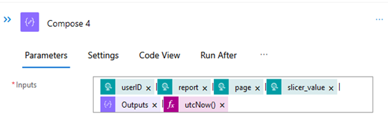
Next, a compose module will be used to create a simple row with all the data. Between elements there are pipes “|” added, that will be used as delimiters.
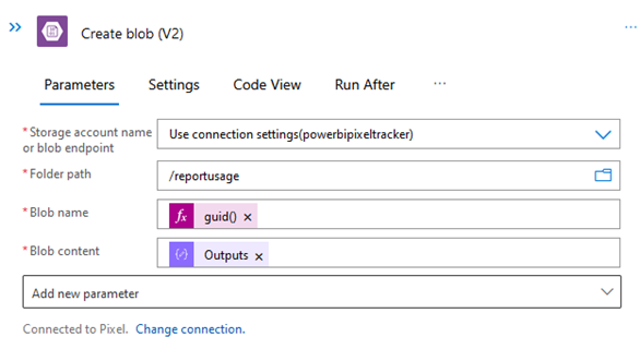
With this, we can now move on to creating a blob on Blob Storage. The file name is going to be random to ensure no data is lost. Content is taken from Compose 4.
When refreshing the URL in the browser, a new file is created:
Power BI
Now that the back-end is ready, it is time to move to the report creation. The plan is rather simple. Two pages, both with the same what-if parameter in a slicer. The pixel will extract user email, report name, page name and slicer value. This might be changed to whatever the requirement is. The only limit is DAX, so checking if slicers are used, if users multiselect values – all that can be tracked!
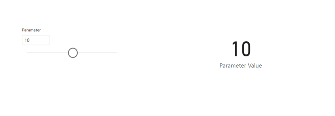
First step is to create a new report. Let’s use enter data and create a simple table. Additionally, a what-if parameter will be created and slicer added to the page:
Next, using DAX we will create a URL from the Logic App, that was created previously. The trigger URL is located in the first block of the app:
Using built-in DAX functions we are able to pass both user principal name and parameter value to the URL:
In “Measure tools” it is very important to change the Data Category to “Image URL”:
Now, when this measure is added to a table, Power BI will query the URL and receive a pixel. It will also provide all the parameters, that will be saved to the blob storage.
A view from Blob Storage:
The image will be refreshed every time a user interacts with the page, this naturally allows to track the usage of the report in a much higher level of details. What is also possible is calculating a web metric called “Bounce rate” – so how many users closed the report right after opening it.
This will require a bit of maintenance though. There will need to be a separate measure per report page and each page will need to have a table with the measure added and hidden.
As visible on the table, it is possible to extract significantly more information about report usage. I would not recommend tracking measures’ values, but using functions like ISFILTERED() or HASONEVALUE() can give you important insights into how reports are being used. This solution may be seen as quite invasive in some organisations, so please do confirm the approach with the business. Apart from that DAX is the limit!
Let me know what you think,
Michał


